|
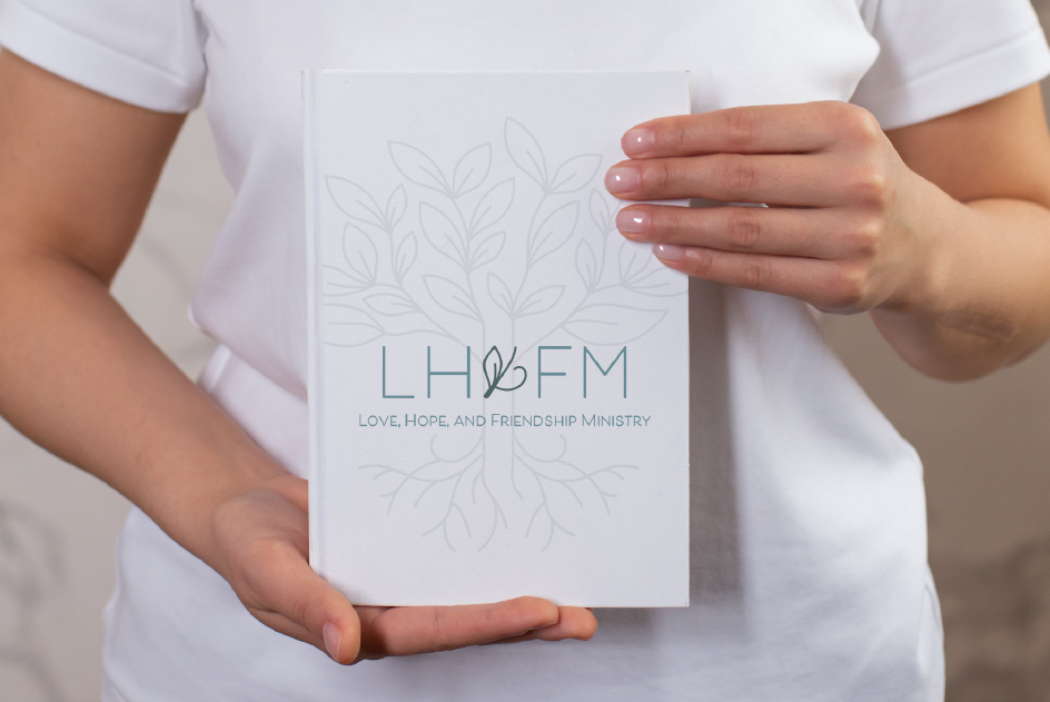
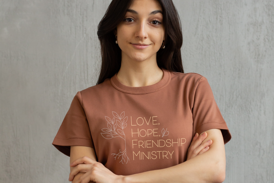
BRAND: Love, Hope, and Friendship Ministry
ROLE: Freelance Graphic Designer YEAR: 2021
|
Love Hope & Friendship Ministry, a faith-based non-profit serving women, sought a logo refresh after two decades. The new design aimed to retain the brand's integrity while appealing to a younger audience. The goal was to preserve the brand's essence while connecting with a younger demographic. Central to the redesign was maintaining the symbolic representation of unity and support through a tree motif, emphasizing growth rooted in Christ. Our final direction offered a modernized approach that aligned with the organization's diverse needs and aspirations.
|
COLOR THEORY
|

BRANDING & CONTENT CREATION
|

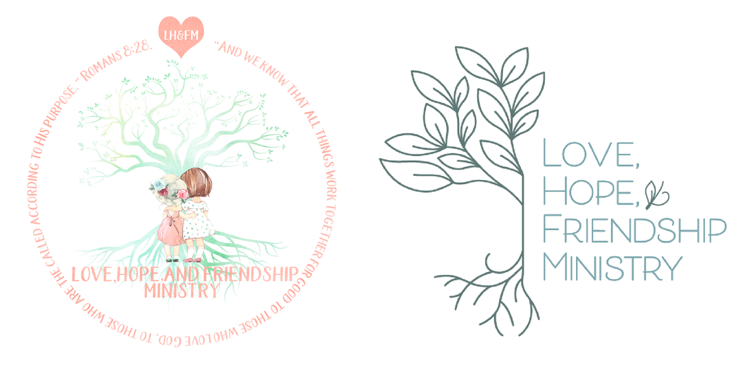
ORIGINAL LOGO - UPDATED LOGO
|
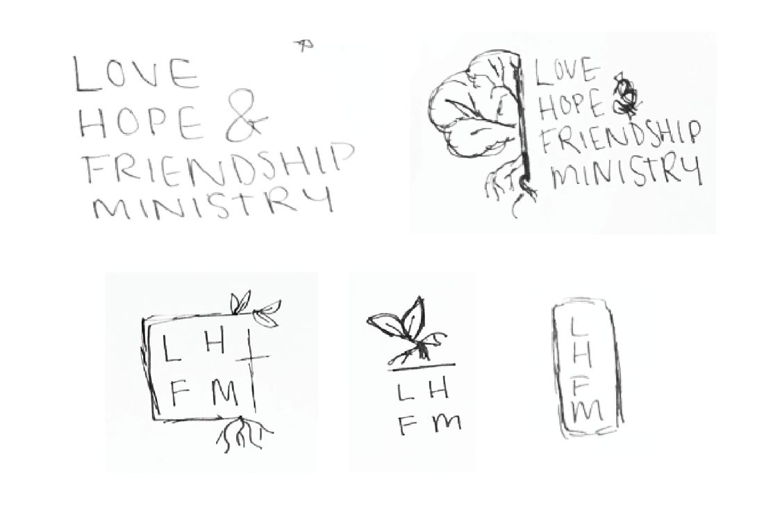
INITIAL SKETCH DIRECTION
|
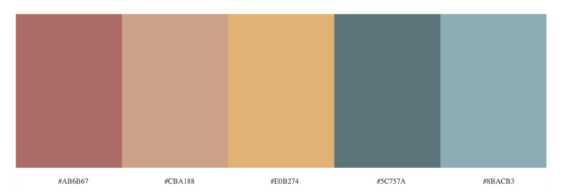
Color Theory
Color plays a pivotal role in brand identity, communicating messages, and evoking emotions. When crafting a color palette, I prefer to incorporate 5-6 harmonious colors that resonate with the brand's essence and narrative. Ensuring these colors complement each other is essential for versatile application across various branding materials. It's about finding the perfect hues and values that authentically tell the brand's story and resonate with its audience
|
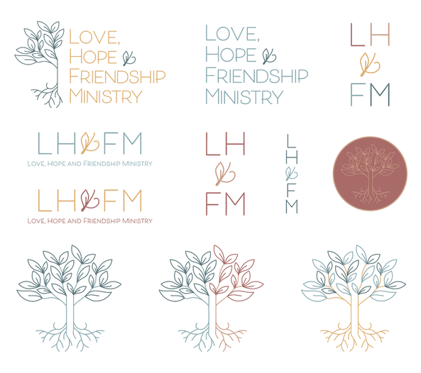
FINAL BRANDING SUITE & MARKS
|
