|
CONTRIBUTIONS:
Brand Identity Creative Direction Drawing & Sketching Graphic Design Illustration Key Art Typography |
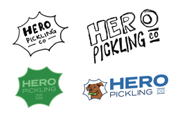
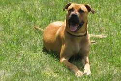
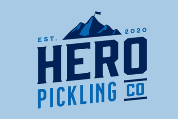
Hero Pickling Co., a family-run craft pickle business, sought logo options for their packaging and marketing materials to enhance brand recognition as they expanded into local retail distribution. Initially inspired by their cherished family dog, Hero, they considered a playful comic-book style featuring Hero as the mascot. However, they ultimately opted for a "craft brewery" aesthetic, incorporating elements reflecting their heritage and pride in their home state of New Hampshire.
|
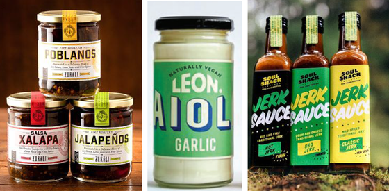
MOODBOARD DIRECTION
|
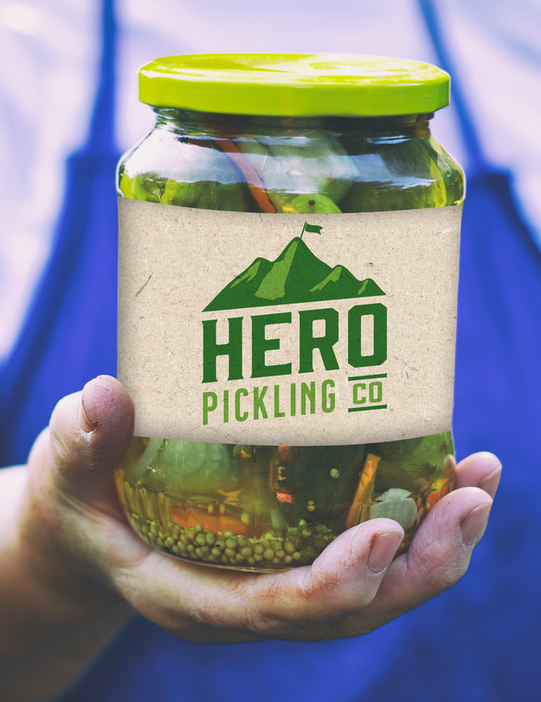
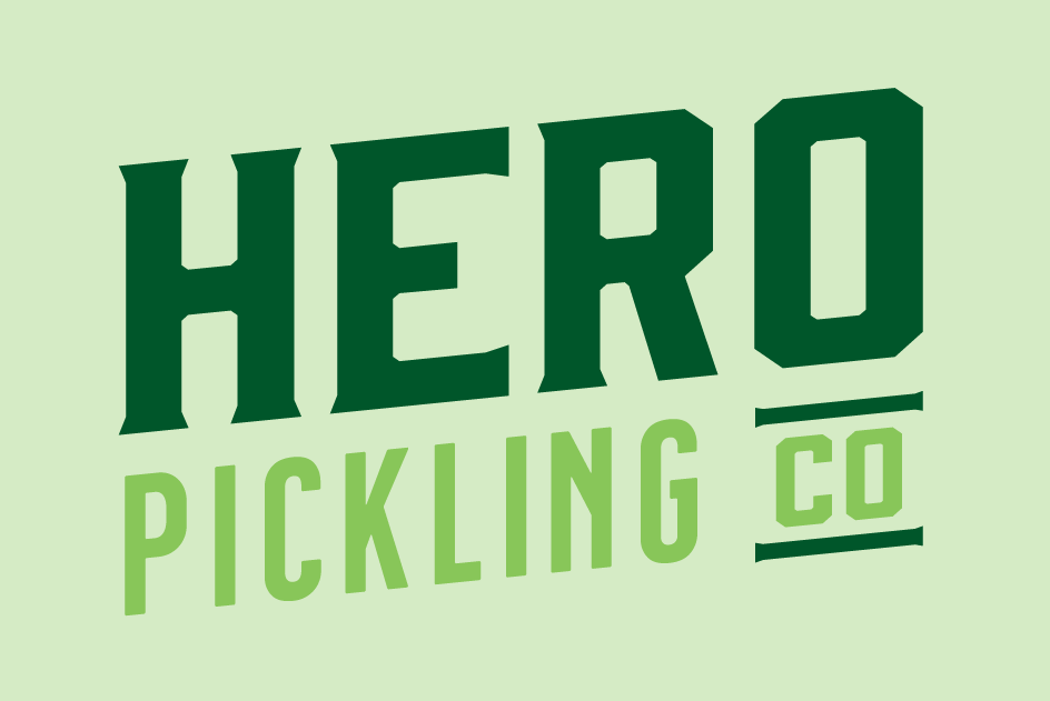
BRAND IDENTITY & KEY ART
|
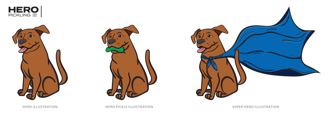
KEY ART & ILLUSTRATION
|
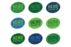
BRAND EXTENSION
|
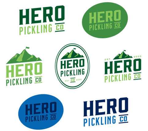
FINAL BRANDING SUITE
|
Limitless Opportunities
In branding, I advocate for versatile and functional marks that are easily recognizable. Consistency is key to boosting brand awareness, which is why I prioritize establishing diverse adaptations within brand guidelines from the outset. This ensures flexibility as the brand evolves and grows
|
